Bachelor Thesis · UX/Product Design
Passage — Routes that fit you
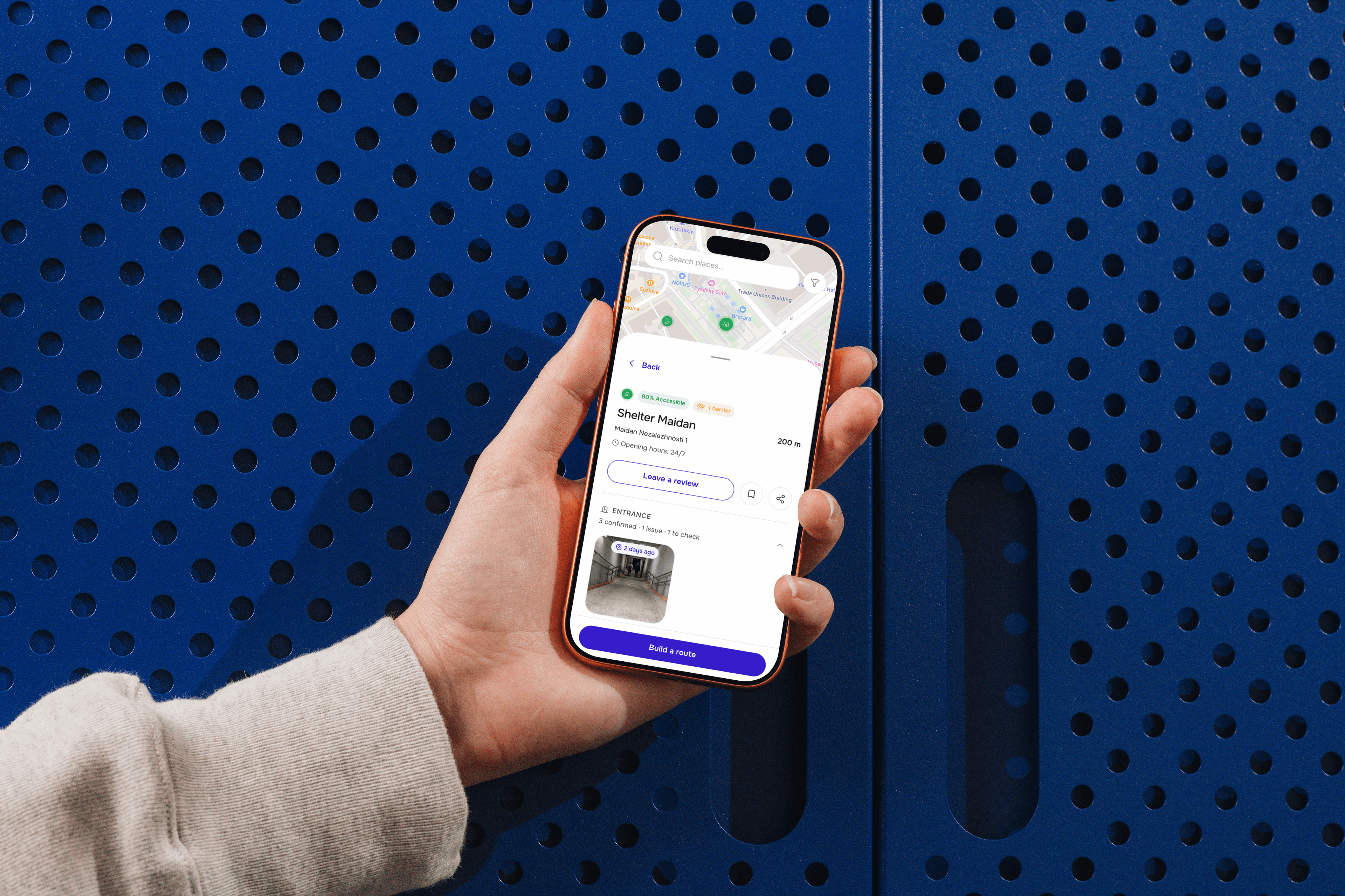
A personalised route-planning concept helping wheelchair users trust accessibility information in a city shaped by war.
Background
Ukraine's disability population has grown faster than its cities have adapted. War adds layers most navigation apps were never built for: structural damage that turns a safe route into rubble, power outages that disable lifts for hours or days, and air-raid alerts that mean the fastest route to a shelter matters as much as the most accessible one.
6M+
estimated people with disabilities in Ukraine (official count: ~3M)
71.9%
of people with disabilities report difficulties using transport infrastructure
92%
of bomb shelters are inaccessible to people with limited mobility
Problem
Existing tools weren't built for a city where accessibility itself is a moving target.
- Structural damage can make a previously accessible route impassable with no warning
- Power outages, common in winter, take lifts and elevators out of service — the exact infrastructure wheelchair users depend on
- Air-raid alerts add urgency: reaching a shelter quickly can matter as much as reaching it accessibly
- Curfews and unpredictable disruptions mean the "safe window" to travel isn't constant
Research
16 semi-structured interviews — wheelchair users, mothers with strollers, older occasional city visitors, and accessibility organizations — analyzed with Reflexive Thematic Analysis.
Trust, not tech, is the barrier.
People don't distrust apps — they distrust unverified data.
Binary labels erase real users.
"Accessible / not accessible" ignores everyone who doesn't fit the average case.
Accessibility is dynamic, not fixed —
reshaped day to day by damage, outages, and alerts.
Trust is visual.
Photos and timestamps outrank written descriptions every time.
How can a personalised accessibility concept be designed to earn wheelchair users' trust when planning routes through Ukraine's volatile urban environments?
Why an app
Ukrainians already navigate their cities on their phones. An app can update in real time, meet people where they already are, and layer personalization on top of existing data — something a print solution or website can't do fast enough for a wartime context.
Who it's for
Primary
Wheelchair users in Ukraine, from new to experienced.
Secondary
Parents with strollers, older occasional visitors — their needs cross-validated design decisions but weren't the design target.
Out of scope (deliberate)
Visual/hearing impairments — this project focuses specifically on physical/mobility navigation.
Benchmarking
Audited navigation and accessibility apps across Ukraine, Germany, Austria, Japan, and Canada.
- Onboarding personalization rarely reaches the actual route shown
- Accessibility data exists, but scattered — never as a route-level trust summary
- Reviews are either too shallow to trust or too demanding to finish
- Dynamic barriers (crowding, sudden inaccessibility) are ignored almost universally
- Binary labels consistently exclude anyone who isn't the "average" case
Implementation
A design system built in Figma, carried through into shipped code — using AI tools alongside my own iteration.
Design
Using AI tools — Lovable, Claude Design — alongside my own iteration, I built a 25-component design system with defined variables for colour, spacing, and type. Frames were renamed and structured for machine-readability, so the system could be read cleanly by Claude Code in the next step.
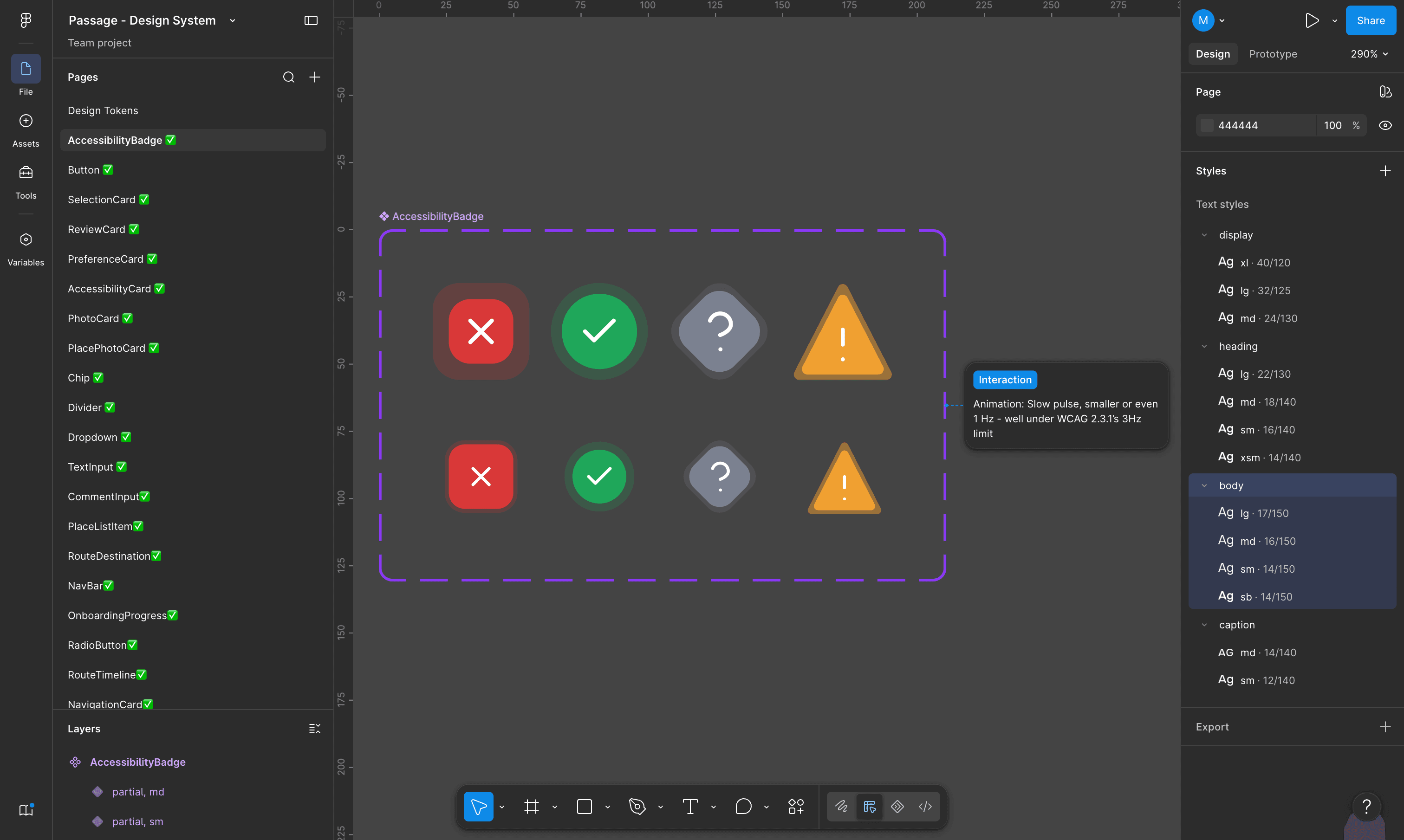
Design system in Figma — colour, type, and spacing tokens as a single source of truth.
Code
Connected the Figma design system to Claude Code via the Figma MCP integration. Built on React, TypeScript, Tailwind CSS, and Vite — components were implemented one by one, each checked for accessibility (keyboard navigation, ARIA attributes, focus states) as it was built.
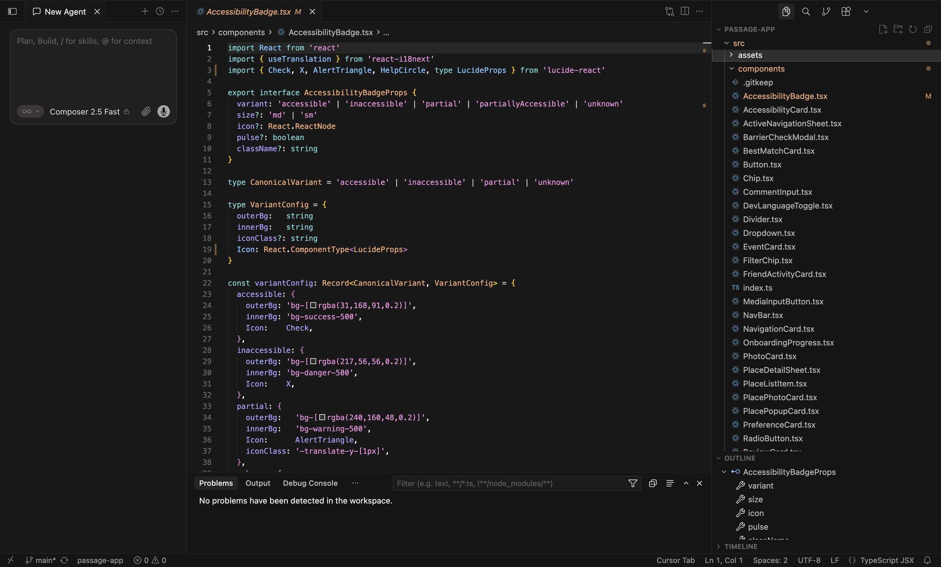
25 components implemented in the codebase, built from the same token system.
Bringing the research question to life
How can be designed to when planning routes through ?
Screens
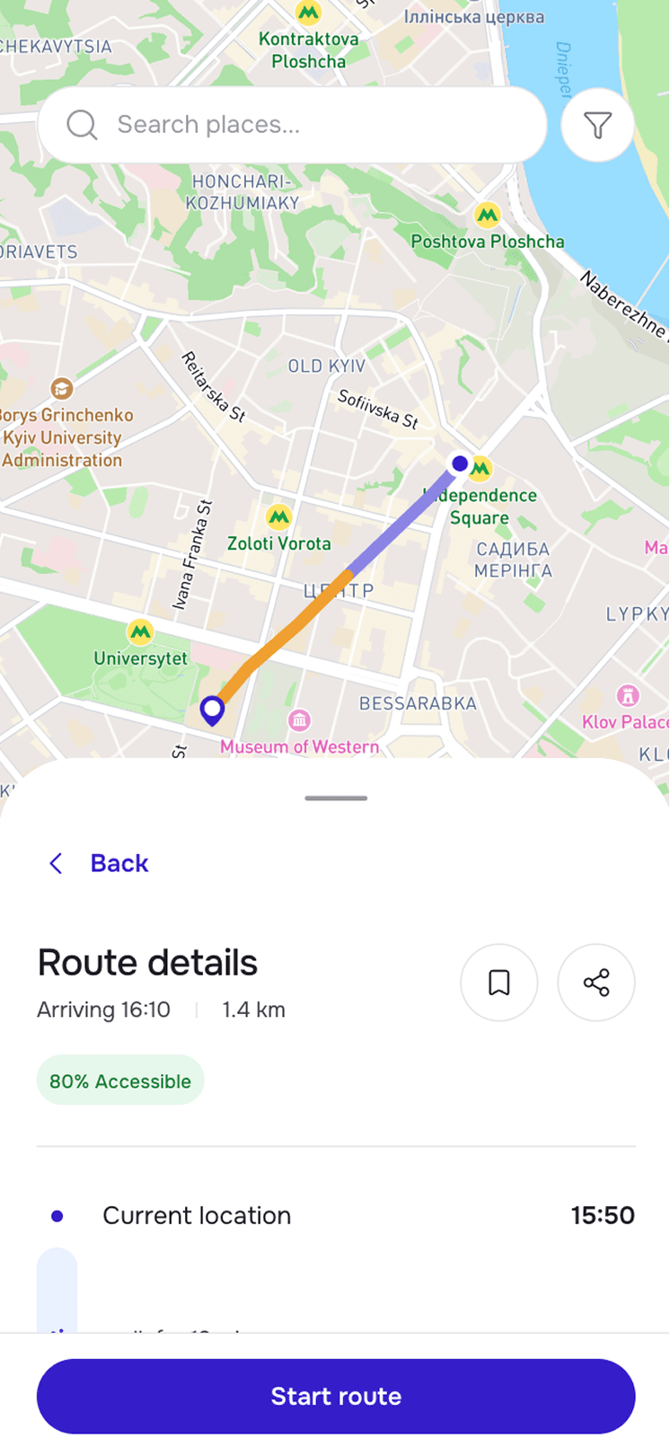
ROUTE DETAILS
A live accessibility score shown before you commit to a route — not after you've already started walking it.
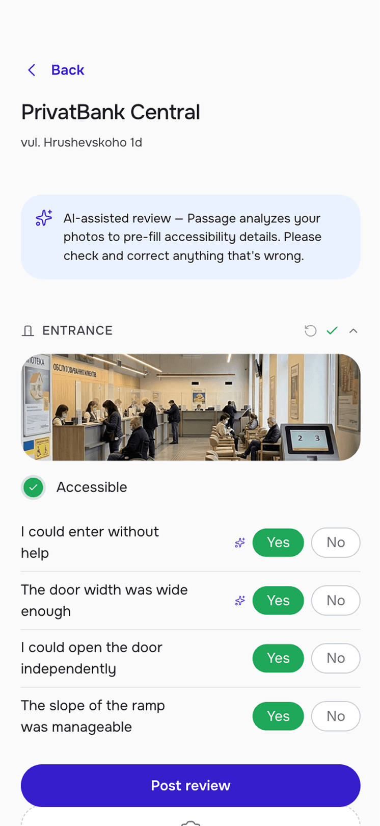
AI-ASSISTED REVIEW
Passage pre-fills accessibility answers from your photos — you only need to confirm or correct what it gets wrong.
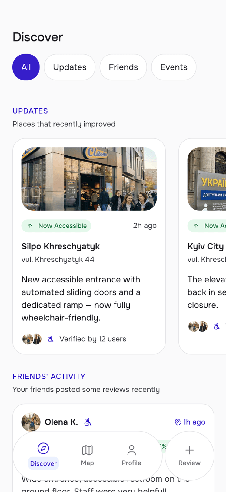
DISCOVER
Recently improved places and friends' verified reviews, surfaced before you even start searching.
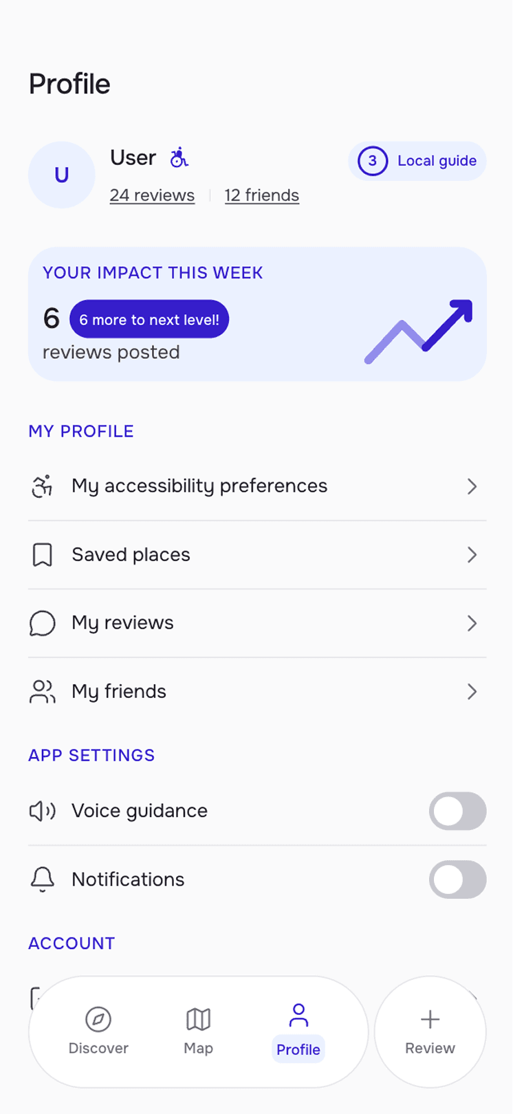
PROFILE
Contribution stats and a progress indicator that reward ongoing accessibility reporting.
Validation
Presented in Odessa to accessibility auditors, then tested with 8 users in Think-Aloud sessions — several of whom were also original interview participants, giving a direct check between what people said they needed and what they actually did.
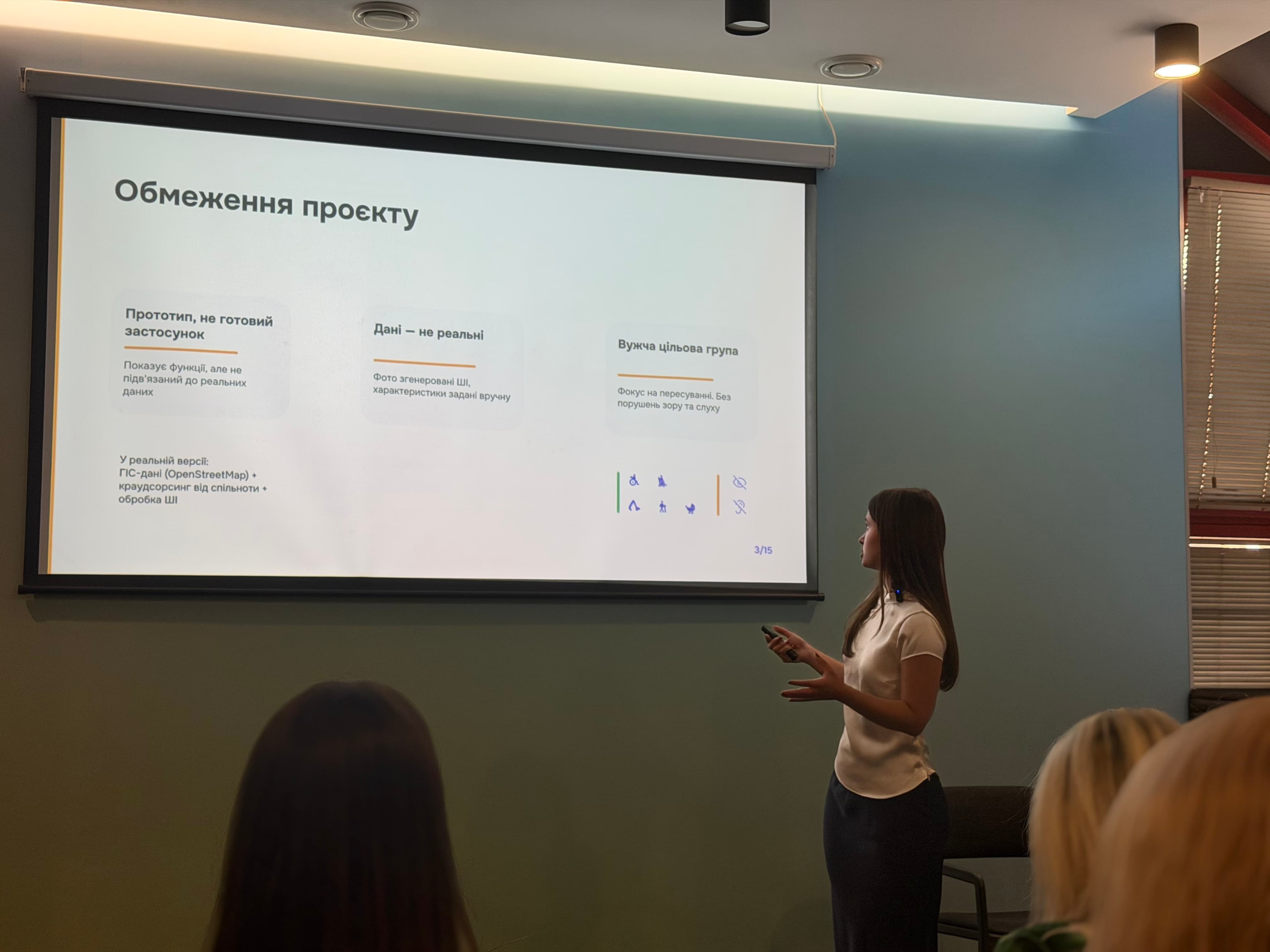
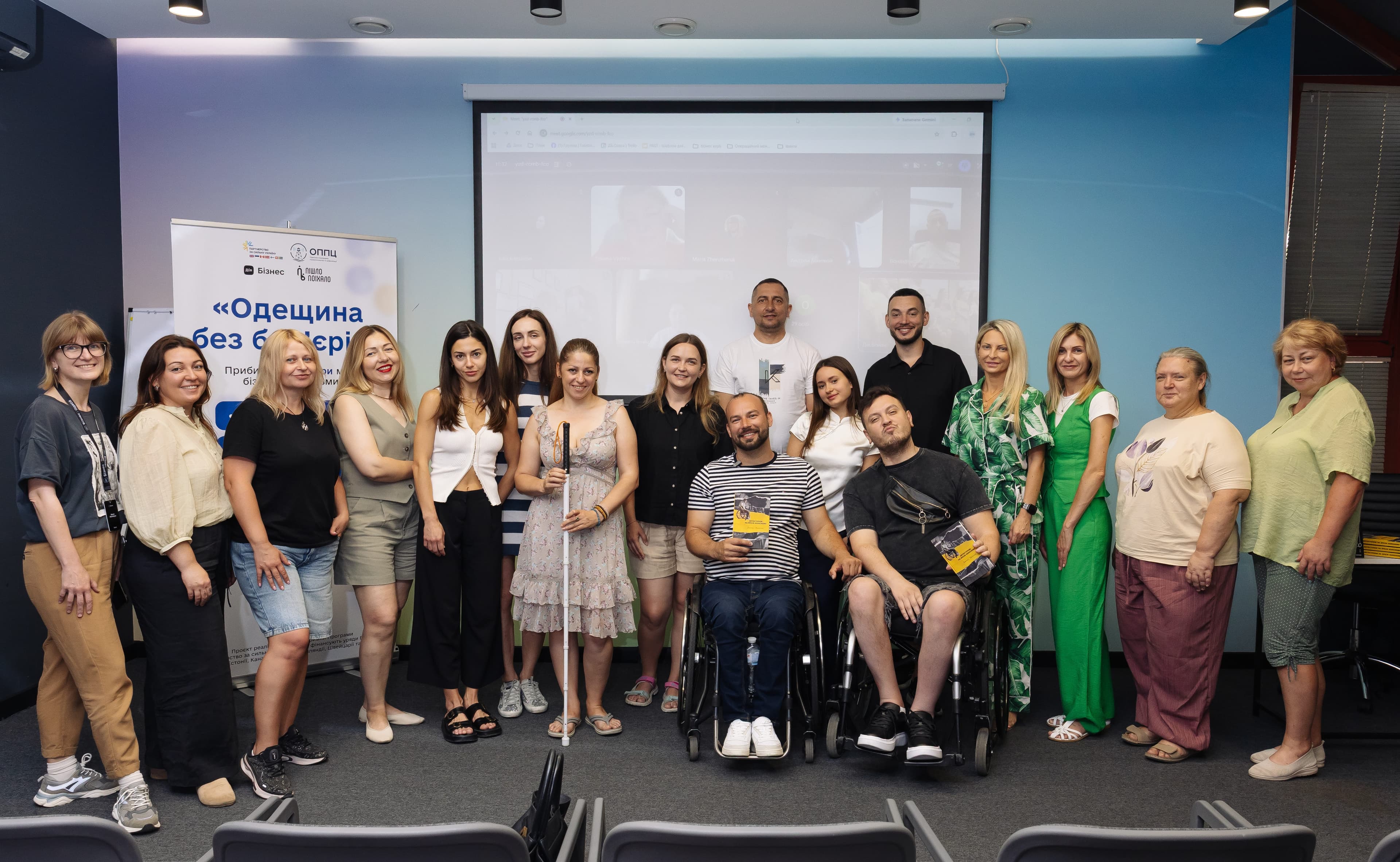
Presenting Passage at accessibility event in Odesa